

Project tracking sucks. Use Delivery Maps
The harsh truth about software projects
Have you ever worked in a software project without being able to answer some basic question like:
“how is it going?”
“where are we?”
“will we deliver on time?”.
You know that feeling, right? Deep down you know you should be able to answer, but in reality you have no clue. You can provide an answer, mostly based on your intuition, but you know there is no evidence backing that intuition.
The harsh truth about software projects
During my early days as an engineering manager, I suffered from this pain as I got asked those questions frequently and I was accountable for making sure the answer was as truthful as possible.
The best way I’ve found to solve this roots itself in my passion for visualizing complexity. By Visualizing Complexity I mean creating visual tools that help people quickly grasp intricate information. One example of this, is the outcome of an Event Storming session as it lays out all the necessary information on a canvas allowing to understand flows of a business, a feature, etc.
Visualizing Complexity: Delivery Maps
That’s when I developed what I now call Delivery Maps—a living, visual representation of project execution that evolved far beyond a static Gantt chart.
I started small:
A timeline, split in weeks.
A visual now indicator
Boxes to represent work items, sized according to the timeline.
Expected delivery dates or timeframes
I then started adding visual cues about anything that can affect the delivery, including the environment in which the project is getting executed:
Capacity changes: holiday season, company events, long sick leaves, team composition changes, etc
Needs that must be addressed before a certain work item can be started, usually a decision to be made.
Dependencies between work items.
Here’s an example of how it might look like:
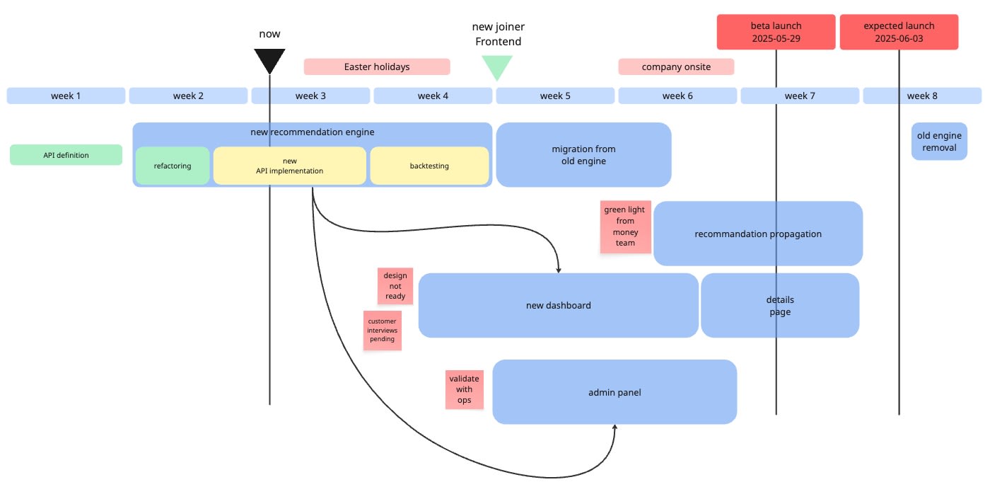
If a Gantt chart focuses and can be useful to plan a sequence of activities, a Delivery Map is a living document that serves equally well planning and execution.
The goal was to create a view that anyone in the company could quickly grasp and use it to answer the fateful question:
HOW IS IT GOING?
It worked incredibly well: I could answer.
Team members could answer.
Leaders and anyone else in the company could answer.
Most importantly, anyone could challenge false assumptions or spot risks we were ignoring, potentially refusing to acknowledge a harsh reality.
External validation
I once gave at a workshop about them in a company. After a short intro I showed the team some real world project’s Delivery Map - each at different stage. Without knowing what the project was about, they were able to tell how each project was going, if there was any risk of it derailing and which remediation steps could have been attempted.
A usual concern
The usual criticism I heard about this approach has been: “I see it’s useful, but isn’t this a time consuming work about work”?.
In reality it takes a couple of hours to setup and about 5 minutes a week to maintain, with some occasional reshuffles; but overall the return on investment has always been on a very positive territory.
I hope I got you interested enough to see more. In the next articles I plan to discuss how to get it started, how to maintain it and the common patterns I’ve observed over time.
Thanks for now, here’s the usual list of
Who is hiring engineers remotely (May)
White Hat Gaming (Europe)
Grafana Labs (Europe and US)
Prima Assicurazioni (Italy)
Boost your chances to get hired by accessing a curated list of 150+ companies hiring remotely. Send me a message.